


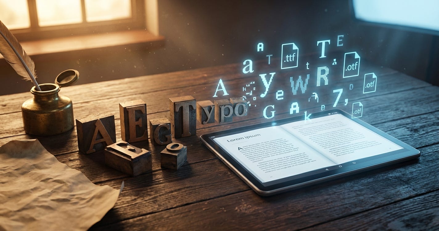
For the modern indie author, a font is more than a stylistic choice. It is a piece of software. Navigating the legal and technical requirements of platforms like Amazon KDP and IngramSpark requires moving past “what looks good” and into the weeds of what is legal and functional.
This guide breaks down the essential typographic knowledge you need to turn a messy manuscript into a shelf-ready book.
The Legal Reality: Typeface vs. Font
In the eyes of the law, specifically in the U.S., there is a hard line between a typeface and a font.
A typeface is the visual design. It’s the “look.” This is generally viewed as a utilitarian object and isn’t eligible for copyright. A font, however, is the digital file itself. That file is protected under copyright as a literary work because it is software.
You are usually allowed to use the look of a classic typeface. But you cannot hand over the font file to someone else without a license. It’s the difference between taking a photo of a car and stealing the engine.
Choosing Your Safe Harbors
Google Fonts
Google Fonts is the safest bet for self-publishers. Almost everything there uses the SIL Open Font License (OFL). You can use them for covers, interiors, and logos without looking over your shoulder.
They are also eBook safe. You are allowed to embed these fonts in EPUB files without paying fees for every title you release, as long as you drop the OFL.txt license file into your package. In late 2025, Google even opened up the sophisticated Google Sans and Google Sans Flex families. These were once private Google assets, but now they are fair game for your branding.
Canva Licensing
Canva is a great tool, but it has some hooks in its licensing that can trip you up.
For Pro users, every time you export a design, you get a “One Design Use” license. This is fine for one book, but if you use the same Pro font for a sequel, a new license is technically issued when you hit export.
There is also a 480,000-pixel limit on unedited Pro content. If you just grab a stock image and use it as-is, you’re stuck with a tiny resolution. The fix is simple: change it. Add your title. Throw on a filter. Move things around. Once you create a “unique composition,” that pixel limit vanishes and the copyright becomes yours.
Interior Layout Recommendations for 2025
For the inside of your book, you want a serif font. Those tiny strokes at the end of the letters help lead the eye across the line. It makes the reading experience less exhausting.
Garamond remains the industry favorite. It is elegant and compact. Because the letters take up less horizontal space, you can actually lower your page count and save on printing costs. Caslon is another staple, often called the “comfortable” font because it’s so easy on the eyes.
If you want something that feels more academic, go with Baskerville. For maximum readability, Sabon is a workhorse. Other solid choices for 2025 include Dante for a modern feel, Bembo for high-end literary works, and Janson for non-fiction. If your book is short and you want it to feel “heftier,” Palatino is wider and will naturally stretch your page count.
Genre Styles and Pairings
Typography is a silent narrator. It tells the reader what kind of story they’re about to read before they even finish the first sentence.
For literary or historical fiction, you want something timeless. Pairing Playfair Display for headers with EB Garamond for the body text creates an authoritative vibe. Sci-fi and futuristic books need a tech-focused, clean look. Try Orbitron for your headers and Montserrat for the body.
Romance and poetry benefit from softer, more decorative choices. DM Serif Display paired with Nunito works well here. If you’re writing a thriller or a horror novel, you need high tension. Bold, high-contrast fonts like Oswald for headers and Open Sans for the body will do the heavy lifting. Non-fiction and business books should stick to approachable, modern pairs like Poppins and Merriweather.
Technical Requirements for KDP and IngramSpark
A beautiful font is useless if the printer rejects your file.
You generally have two choices: TrueType (TTF) and OpenType (OTF). For print-on-demand, OTF is usually better because it handles advanced stuff like ligatures and small caps. But for eBooks, TTF is the safer play. It has better compatibility with older E-ink devices that sometimes choke on PostScript data.
The biggest mistake is failing to embed your fonts. If the font isn’t bundled into your PDF, the printer will just swap it for something like Arial. This causes “text reflow.” Your headers will get cut off, and your page numbers will shift. It’s a mess.
Canva users often hit the “Type 3 Font” error. This usually happens when the export engine can’t properly embed the software. If KDP kicks your file back, try flattening the PDF. This turns the text into a high-resolution image, removing the need for the font file entirely.
The Final Checklist
Before you hit publish, run through these steps.
First, check for commercial rights. If you found a font on a “personal use” site, stay away. Check the “Readme” file that came with the download.
Second, do a pre-flight check. Open your final PDF in Adobe Acrobat. Go to File, then Properties, then Fonts. Every single font must say “Embedded” or “Embedded Subset.” If it just shows the name of the font without that tag, the file isn’t ready.
Finally, when you upload to KDP, choose the right copyright settings. If you’ve followed these rules, you can confidently state that you own the necessary rights. Don’t select “Public Domain” unless you’re publishing a 19th-century classic. Keeping it simple and sticking to open-source options like Google Fonts is the best way to stay out of legal trouble while keeping your book looking professional.
Such great information, all in one article! Thanks!